Uncovering urban circadian pulses based on an animated cartogram: the example of Bogotá
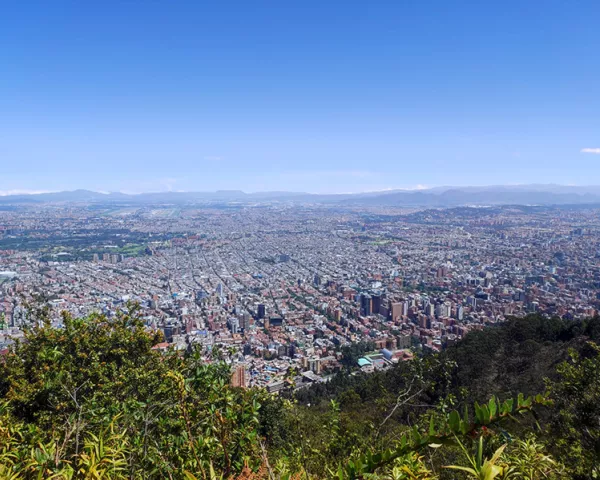
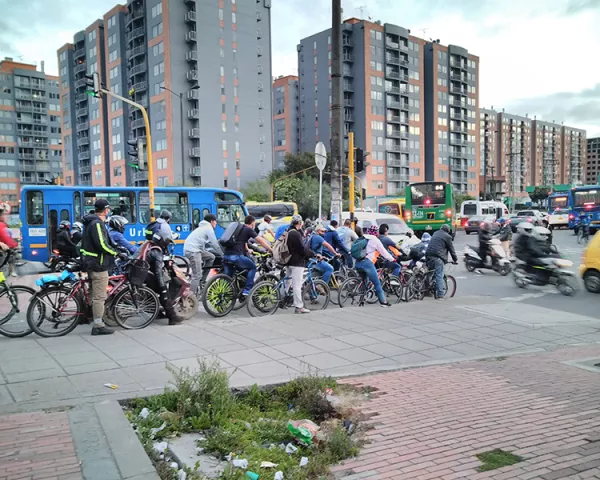
This paper describes a new kind of dynamic map showing the differing location of ‘day’ and ‘night’ populations and how they balance out over 24 h. To this end, we created a smoothed animated cartogram, with visual effectiveness as the main criterion. The area of study is the Bogotá metropolitan area in Colombia, where an urban mobility survey (EODH) was carried out in 2019. This paper emphasizes the method developed and the discussions which arose over the course of our work. We used R language to process the data and create the animations in order to make them reproducible, following an open-science approach. We mainly used the cartogramR, cartography and spatstat packages. The R script is appended.
This paper describes a new kind of dynamic map showing the differing location of ‘day’ and ‘night’ populations and how they balance out over 24 h. To this end, we created a smoothed animated cartogram, with visual effectiveness as the main criterion. The area of study is the Bogotá metropolitan area in Colombia, where an urban mobility survey (EODH) was carried out in 2019. This paper emphasizes the method developed and the discussions which arose over the course of our work. We used R language to process the data and create the animations in order to make them reproducible, following an open-science approach. We mainly used the cartogramR, cartography and spatstat packages. The R script is appended.
